Best Looking Retro Toasters
Top Retro Toasters for Aesthetic Appeal
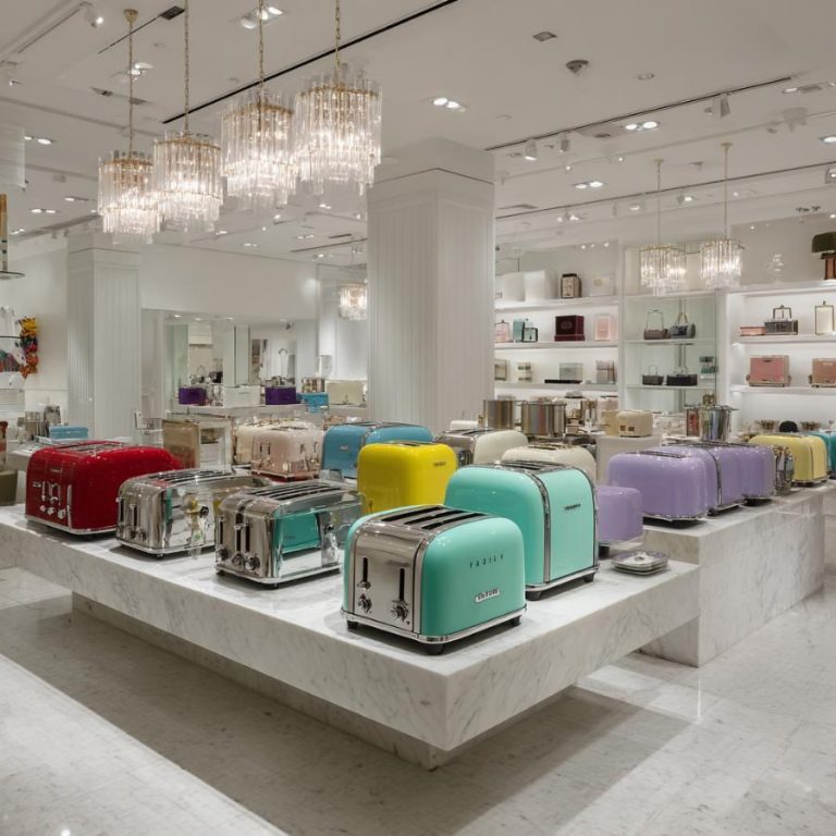
These are, in our opinion, the best-looking retro toasters, blending vintage-inspired design with modern style. Each is selected for its nostalgic charm, vibrant colors, and sleek lines, based on both our toaster experience and user sentiment from around the web.
The list below is our top 5 and include a few points as to why we believe they belong there.
*** See our guide for how to choose a retro toaster.
____
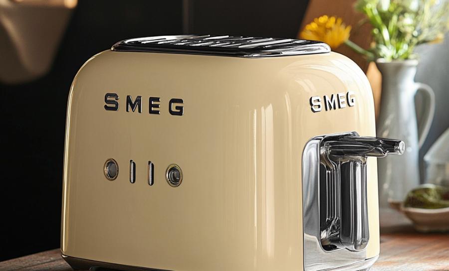
Smeg 50’s Retro Style Aesthetic 2-Slice Toaster
- Sleek mid-century design with rounded edges and glossy finish, resembling a retro Italian sports car.
- Available in seven vibrant colors (black, red, pink, chrome, cream, pastel blue, green).
- Features chrome accents and a backlit knob for a luxurious vintage vibe.
____
Nostalgia RTOS200AQ Retro 2-Slice Bagel Toaster
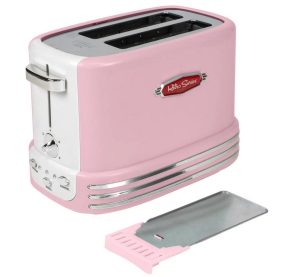
- Bold 1950s diner-inspired look with fire-engine red finish and chrome detailing.
- Compact with white sides and stainless steel top, offering playful retro charm.
- Lightweight plastic construction enhances vibrant, nostalgic appeal.
____
Breville Impressions 4-Slice Toaster
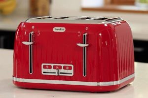
- Elegant retro design in cream, black, or white with textured finish and chrome accents.
- Vintage-style buttons and shade selector slider for timeless sophistication.
- Extra-wide slots and high-lift lever add functional yet stylish touches.
____
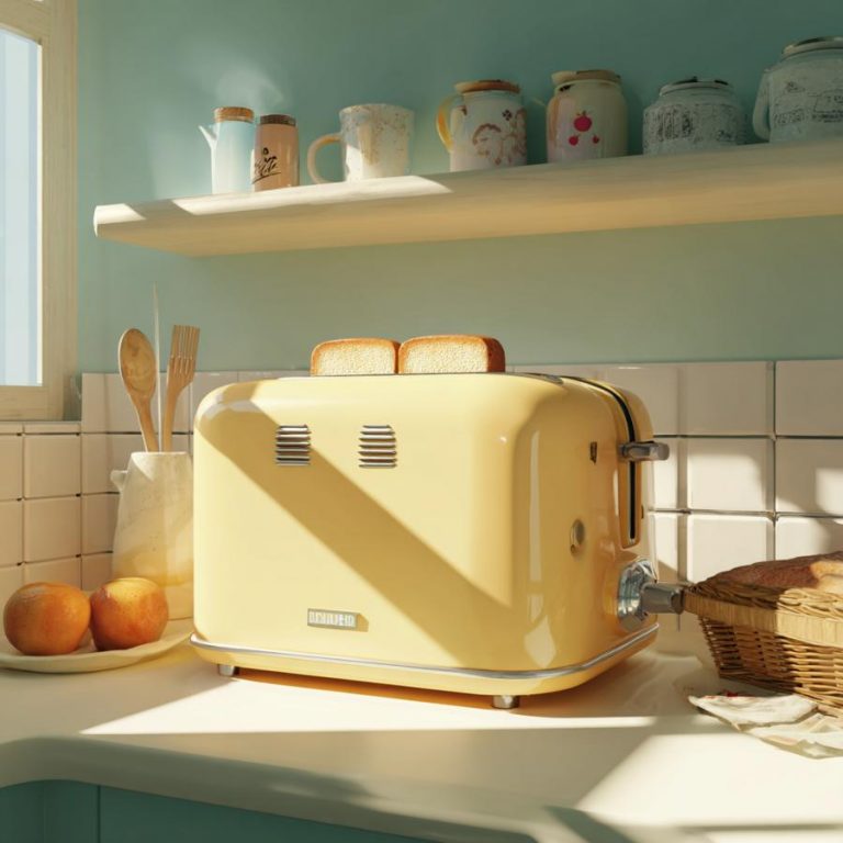
Mueller Retro Toaster
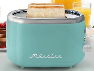
- Compact, charming design in turquoise, black, pink, or white, evoking a cozy, vintage kitchen.
- High-shine stainless steel body with simple controls for whimsical appeal.
- Affordable and space-saving, ideal for small countertops.
____
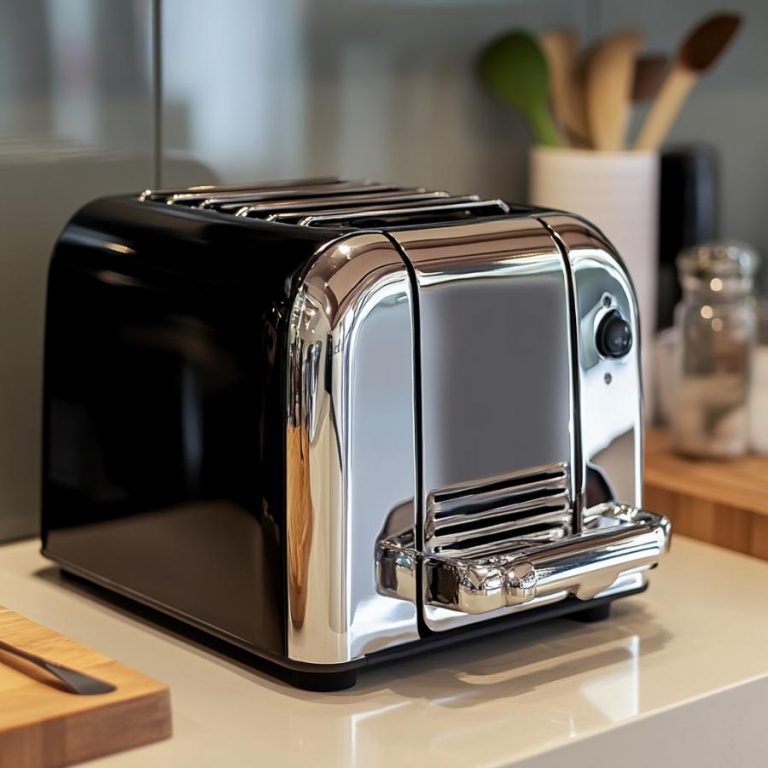
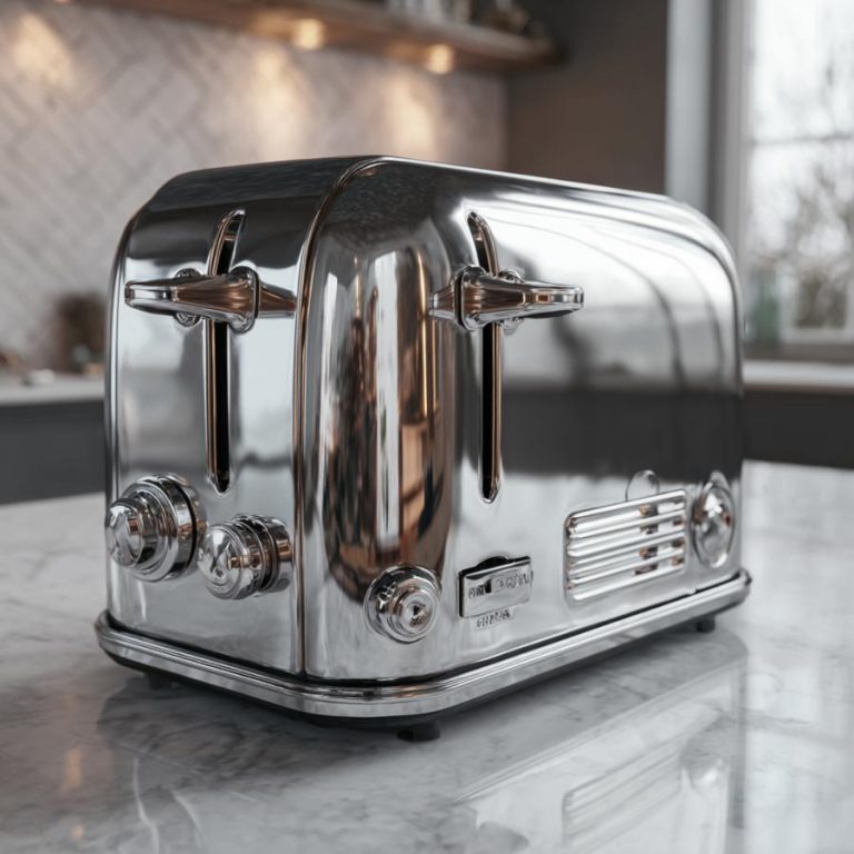
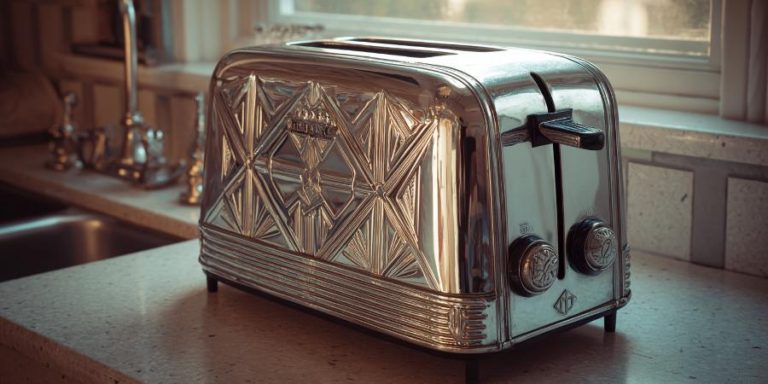
Dualit Classic Toaster
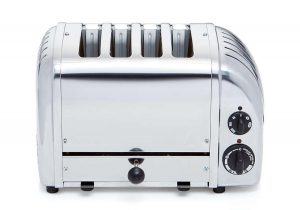
- Timeless industrial retro look with hand-built stainless steel body and chrome finish.
- Minimalist mechanical controls for a sturdy, mid-century modern aesthetic.
- Available in multiple colors, celebrated as a durable design icon.
These toasters combine nostalgic elements like chrome accents and bold or pastel colors with modern aesthetics, making them standout kitchen pieces. Smeg and Nostalgia offer vibrant, eye-catching designs, while Breville and Mueller provide softer, versatile looks. Dualit delivers a timeless, industrial charm.
____
What People look For
As someone who’s spent countless mornings dreaming over perfectly golden toast, I’ve noticed a surge in love for retro-inspired appliances. But what exactly are people looking for when it comes to the “look” of a retro toaster?
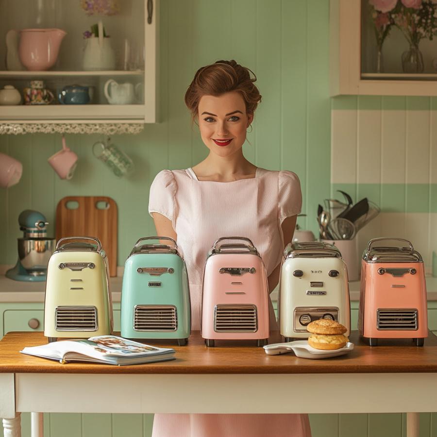
COLOR
Color is everything. Retro toasters are all about bold yet soft hues that scream vintage vibes. Think creamy pastels like mint green, baby blue, or blush pink—colors that could’ve been plucked straight from a 1950s diner. These shades evoke warmth and familiarity, instantly transporting you to a time when breakfast was a family affair. But it’s not just pastels; some folks crave richer tones like cherry red or mustard yellow for a pop of personality. The key is a color that feels timeless yet playful, blending seamlessly with modern or eclectic kitchen decor.
CCs
Next up, curves and chrome. Retro toasters aren’t boxy or utilitarian; they’re designed with smooth, rounded edges that mimic the swooping lines of vintage cars or old-school radios. The addition of chrome accents—think shiny levers, knobs, or trim—adds a touch of glamour without being over-the-top. These details catch the light just right, making your toaster a statement piece rather than just an appliance. People want that perfect balance of form and function, where the toaster feels like a piece of art but still delivers crispy toast.
TOUCH
The tactile experience matters too. Retro enthusiasts love tactile elements like chunky knobs or satisfyingly clicky levers. These features don’t just look good; they feel good to use, offering a hands-on connection to the past. A toaster with a sturdy, analog feel—maybe even a dial with a gentle tick-tick-tick—adds to the charm. It’s about creating a moment of joy in the everyday, turning a mundane task into a mini ritual.
SIZE MATTERS
Size and proportion also play a role. People want a toaster that’s compact enough to fit on a countertop without dominating it, yet substantial enough to feel like a centerpiece. A retro toaster should look like it belongs in a cozy, curated kitchen, not a sterile showroom. This means clean lines, a slightly chunky silhouette, and a footprint that says, “I’m here to stay, but I won’t take over.”
THE REAL DEAL
Finally, branding and authenticity seal the deal. Buyers gravitate toward toasters that feel like they’ve been pulled from a bygone era, with logos or fonts that nod to mid-century design. Whether it’s a vintage-inspired brand name or a subtle embossed detail, these touches make the toaster feel like a time capsule.
It’s about feeling. It’s the warmth of nostalgia, the joy of tactile design, and the thrill of a colorful, curvy appliance that makes your morning toast feel like something out of the past.
Why Looks are Important
There’s a magic in the look of a retro toaster that goes beyond style—it’s a psychological hub for your kitchen. We can tell you that the aesthetic of a retro toaster isn’t just about looking cute. It’s about how it makes us feel.
NOSTALGIA
First, a retro toaster’s aesthetic taps into nostalgia, that warm, fuzzy feeling that transports us to a simpler time. Those soft pastels or bold vintage hues—think baby blue, buttery cream, or diner-style red—aren’t just colors; they’re time machines. They remind us of grandma’s kitchen, Sunday mornings with pancakes, or the comforting hum of a mid-century radio. This nostalgia reduces stress and boosts mood, creating a sense of safety and familiarity in our modern lives. People are drawn to these toasters because they capture a longing for connection to the past, a moment when life felt slower and more intentional.
HUMAN FEEL
The curves and chrome details also play a big role in our emotional response. Unlike sleek, modern appliances that can feel cold or impersonal, a retro toaster’s rounded edges and shiny accents feel inviting, almost human. These design elements mimic the organic shapes we associate with comfort—like a well-worn armchair or a vintage car. The chrome levers and knobs add a touch of glamour that sparks joy, making us feel like we’re indulging in something special.
TOUCH
Tactile design is another win in terms of why looks are important. Those chunky knobs and satisfyingly clicky levers aren’t just fun to use—they create a sense of engagement. In a world dominated by touchscreens and automation, the hands-on experience of a retro toaster feels grounding. People are drawn to this tactile connection because it fosters a sense of agency and joy in the mundane, making them feel more connected to their space.
SELF EXPRESSION
The aesthetic also ties into identity and self-expression. Choosing a retro toaster in a bold mustard yellow or a delicate blush pink is a statement about who you are. This act of personalization boosts confidence and satisfaction, as our surroundings reflect our values and personality. A retro toaster becomes a conversation starter, a piece of decor that tells a story.
WARMTH & JOY
Ultimately, people are chasing a feeling of warmth, joy, and individuality. A retro toaster’s look isn’t just about aesthetics—it’s about capturing a sense of comfort, sparking delight, and creating a kitchen that feels like home. It’s a reminder that even the smallest details can make your heart sing.